 Store Screenshots
Choose a layout
What each layout does, how many screens it takes, and which to pick for your first picture.
A layout decides where the phone sits and where your words go. Every slide uses the same one, unless you give a slide its own.
Choose a layout
A layout sets how the phone sits on the picture. Open the Layout tab and click one. Some layouts use one screenshot, others use several.
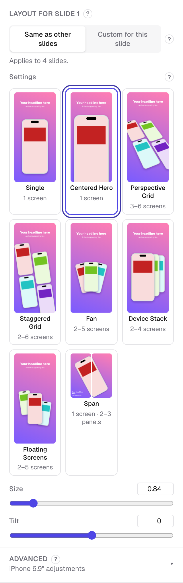
Every slide uses the same layout, so your set looks like a set. To change one slide only, switch it to Custom for this slide.
Every layout
Single · 1 screen
One screen, one line of text. The plainest choice, and the easiest to read.
Centered Hero · 1 screen
One big screen below your words, running off the bottom edge. A good first picture.
Perspective Grid · 3–6 screens
Several screens laid on a tilted plane. Shows a lot of your app at once.
Staggered Grid · 2–6 screens
Screens in a loose grid, each one offset. Busy, in a friendly way.
Fan · 2–5 screens
Screens spread like a hand of cards. Good for showing choice or variety.
Device Stack · 2–4 screens
Screens stacked behind each other. Suggests depth without much clutter.
Floating Screens · 2–5 screens
Screens drifting apart at different sizes. Playful, and good for a feature tour.
Span · 1 screen · 2–3 pictures
One phone running across two or three pictures, so the set reads as one scene.
Hero & Supporting · 1–3 screens
For wide pictures: your words on one side, a main screen on the other.
Wide Row · 2–5 screens
For wide pictures: a row of screens turning away from you, with a headline above.
Icon & Promise · 1 screen
For wide pictures: your icon, your name, one promise, one screen.
Make your screenshots now — it runs in your browser, and your images stay on your computer.